HU3630: Typography
Resources and Thoughts

Main menu

Skip to content
  • History
  • Inspiration
  • Tips & Tricks
  • InDesign
  • Design
  • Publishing Industry
Design

Arial vs. Helvetica

by hu3630type • January 21, 2015 • Comments Off on Arial vs. Helvetica

arial_v_helvetica
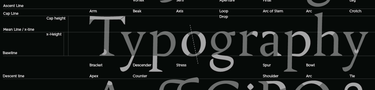
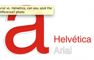
As a precursor to your own typeface analysis/comparison, this examination of Arial and Helvetica provides a useful example.

After you’ve read up, try this quiz, “So you think you can tell Arial from Helvetica?” People get a little goofy about the battle between these two typefaces. Check out mimeart’s game that invites you to help Helvetica give Arial the boot!

Post navigation

← Registration vs. Black Swatch
Random House: Publishers Add Value →

About

This website provides resources and information for students in HU3630: Publications and Information Management at Michigan Tech University.

RSS Feed of the Week

  • A Font Lover’s Guide to Numerals
  • Steven Heller’s Font of the Month: Ella
  • Launching Martin Majoor’s Comma Sans
  • Steven Heller’s Font of the Month: Homage Script
  • Steven Heller’s Font of the Month: Cubo

Tags

1930s Bell Centennial GREP highlight InDesign Matthew Carter Numbered Lists serif text Times New Roman Type Design Verdana

Copyright © 2025 HU3630: Typography. All Rights Reserved. The Magazine Basic Theme by bavotasan.com.